CASE STUDY
MISSION STATEMENT
Cinemauto is the organization bringing you thoughtful immersive drive-in screening experiences marrying entertainment, art, food, culture, and community while promoting local businesses and fostering inclusive programming celebrating diverse, original voices, and a new generation of film makers.
THE ASK
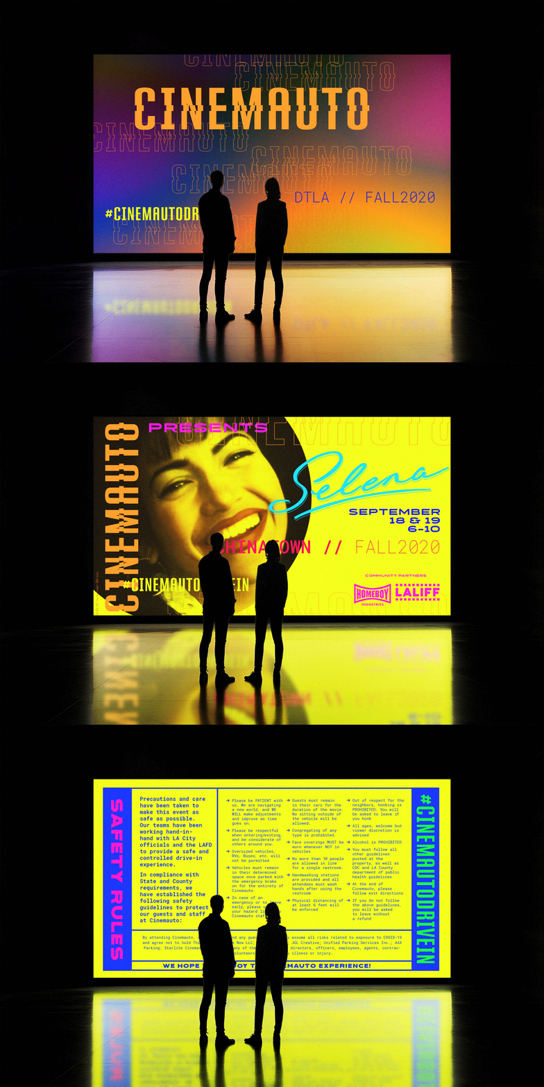
Design a new, yet familiar artistic digital-first visual language for Cinemauto that bridges Angelenos Gen X through Z generations.
BOLD
•
INDEPENDENT
•
RETRO
•
COUNTER-CULTURE
•
BOLD • INDEPENDENT • RETRO • COUNTER-CULTURE •
KEYWORDS
THE SOLUTION
Brutalist Punk
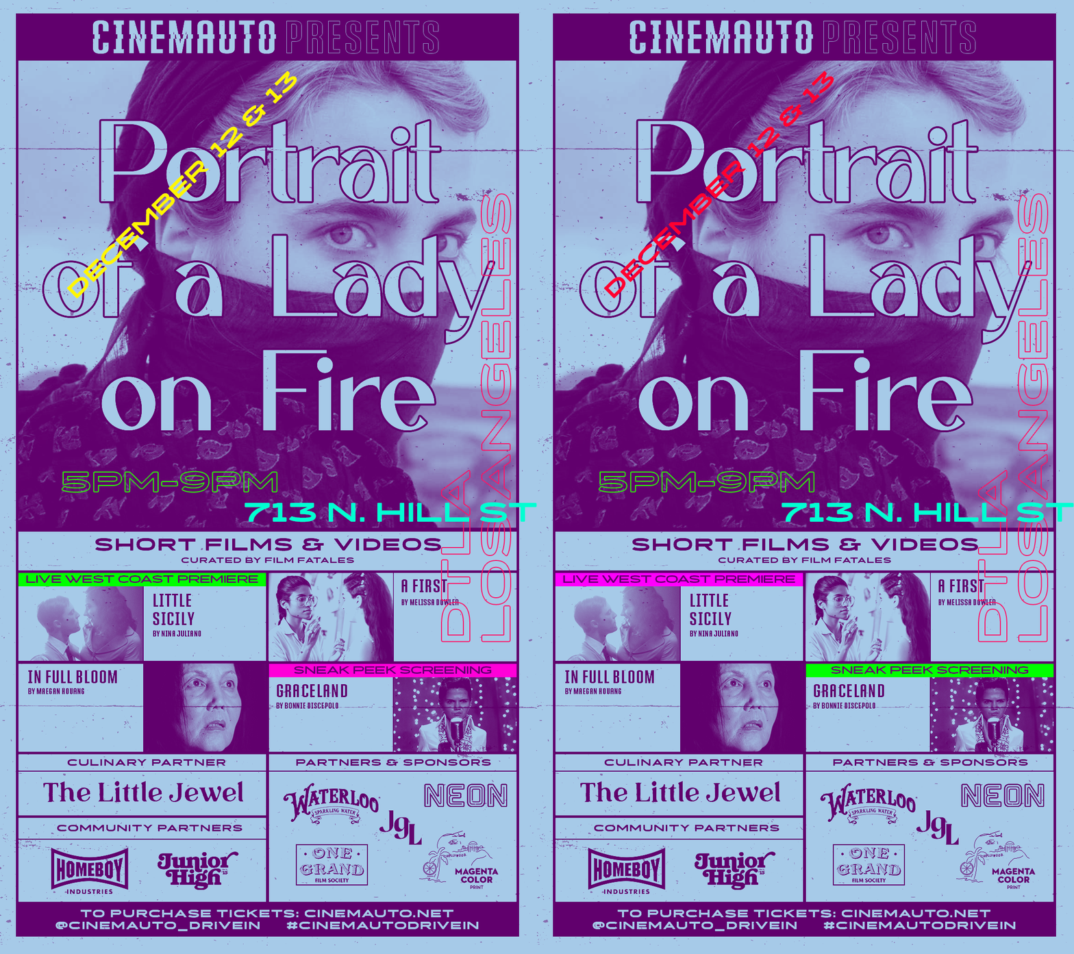
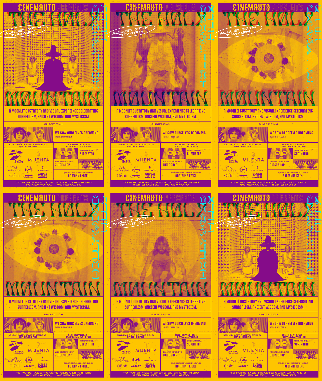
Cinemauto’s spirit is akin to he punk bands of the 70s & 80s: independent and counter-culture. Often they made promotional flyers which were reproduced using a Xerox machine, giving the paper a “grunge” look. Brutalist is the hottest trend in design right now. It hearkens back to web design of he early 90s: bright neon colors, repeat/glitching type. Both share similar design qualities.
LOGO
The logo type was inspired by the original Macintosh OS font, Chicago. Instead of just a simple logotype, I wanted to ensure that Cinemauto, had something that hearkens back to film. Since I was referencing art of the 80s, I thought about the glitching that occurred when rewinding a VHS tape.
COLOR PALETTE
The selected palette would change according to the feature film. The colors would be super saturated, neon-esq colors, which especially work for digital.


